In a world where all the competing screens fragment our attention, a poor user experience (UX) can doom your website, app, or software to the technology graveyard. Uptrends understands how important your product’s performance, load times, and error-free user experience are to your success, and one area many web designers overlook is the 404 error, page not found.
Of course, Uptrends’ monitors will notify you if any requests for your monitored pages start issuing 404 errors, but you can’t stop all of them from happening, especially when user error is involved. A 404 error happens for many reasons:
- Someone unwittingly changed a URL not realizing the page has multiple links,
- Pages get brought down permanently or for maintenance,
- Old links from external websites, and
- Users miss-typed the URL.
When a 404 error occurs, not all domains handle them gracefully.
If you start looking for 404 errors on the web, you’ll see some great and not so great examples of how to handle 404 errors. In fact, one major US retailer actually redirects to a blank page. Blank! Their page doesn’t even give an error message, a big fat nothing. The blank page is probably the worst UX for a 404 error, but the default isn’t much better:
Not Found
The requested URL was not found on this server.
The best way to handle a 404 error is a topic of debate among many UX professionals, but most agree that the default error page or a blank page is not the way to go.
We looked at how some of the busiest sites handle 404 errors, and we have listed some of our favorites. We follow this with a short list of recommendations for your 404 error handling. To generate the 404 errors for this report, we played pirate and simply added, “/arrgh” to the websites’ home page URL.
Apology accepted
Sure, the user may have caused the error themselves, but does the user care about who is at fault? No! Many sites use the 404 error to show their human side and make amends.
Neiman Marcus’ 404 page states that the page is no longer available followed by, “We apologize for the inconvenience.” Neiman Marcus keeps the message simple but maintains the formality of the voice used on their support pages.

Why not have a laugh?
Another way sites show their human side is to have a laugh. Of course, based on the audience, they may need to keep it reined in a bit, but it doesn’t hurt to have some fun. We found several sites (including our own) that take a sympathetic, yet light approach to presenting the error information; i.e., cushion the blow.
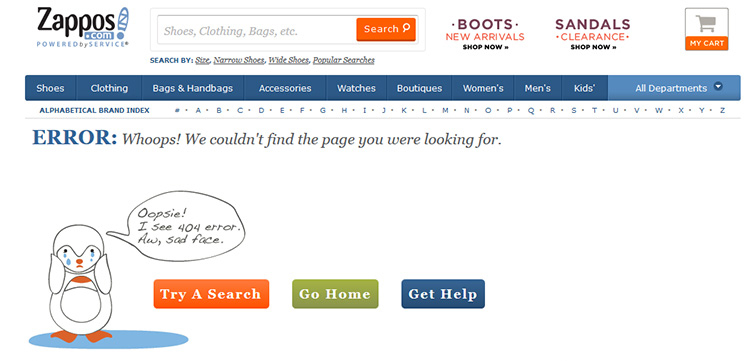
Zappos.com considers their mostly female audience with their 404 page. Words like “Whoops” is a quick acknowledgment that an error occurred without passing judgment. Some may consider their crying penguin-like figure with the message “Oopsie! I see 404 error. Aw, sad face.” as a bit over the top, but this simple message tells the user that Zappos cares, and the user may get a giggle as well.

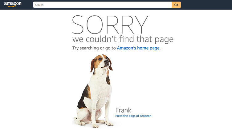
Amazon apologizes and then takes the opportunity to share something unexpected, their employees’ dog photos. If you click the link, you get a page with sweet pooch photos and mini-bios.

A little help here!
Some sites offer possible reasons why the user landed on the page, but the better pages offer the users a means to find their content. Some sites keep the page header active to provide the user with navigation to the site’s content. Other sites offer a link to the homepage, while some sites attempt to make suggestions based on the invalid URL. The main point is that they do not want the visitor to use the back button and leave the site.
Forbes.com takes a moment to have fun with the error code, makes several recommendations including the sitemap, and their 404 error page preloads the search box. Forbes keeps the full site header and footer accessible to the user.

Things to consider for your site’s 404 error page
A successful UX acknowledges the error, describes the error, and gives the user the means to recover. Anything less is a missed opportunity. Here is a list of things to avoid when handling 404 errors.
- Don’t blame the user. Sure, the user might have been doing something stupid (like appending “/arrgh” onto the URL), but don’t tell them that! Own it! Humble yourself and take the blame, or, at the very least, acknowledge the error without any degrading or derogatory language. Even a playful jab at the user can backfire.
- Don’t redirect. Again, you need to own the error and let the user know that an error occurred. An auto redirect without notifying the user confuses and frustrates many users. Most large sites discontinued using redirects for 404 errors, but one movie-streaming site still redirects to the login page on most 404 errors. Bed Bath & Beyond gives the user a warning about the redirect with enough time for the user to back out of the page.
- Don’t assume the user knows what 404 means. You don’t even have to put the error code on the page, but many sites do include the code. The important information is that you couldn’t find their page, so tell them with words, not some meaningless number.
- Do notify them. Tell them the error occurred, and, if possible, offer possible explanations in a humble, polite, and sometimes playful manner.
- Do offer search if possible. If your site has search capabilities, make sure your user knows it. Preload the box if possible. Make sure the search option is visible and prominent.
- Do give them navigation options. If a user finds themselves at a dead end with no way out except the back button, you may lose them completely. If you can keep the error page within your site’s architecture with the same navigation options, you may have a better chance of keeping users on your site. Many users find sitemaps helpful in 404 error situations.
- Do fix it. When a user gets a 404 error, unless they mistyped a URL, the chances are that they clicked a bad link. Fix the links in your content, and, if possible, contact the owners of the external links to fix them. You can’t control all of the possible sources of a 404 error, but you can make sure your content isn’t the culprit.
- Do be aware. Even Uptrends most basic monitors will alert you if any of your monitored pages start issuing 404 errors. If your page has a Full Page Check Monitor set up on it, you will also get information about 404 errors that occur on your third-party content.
So make sure you give your site visitors the best experience possible with useful and even fun 404 error pages. This is your opportunity to turn a bad situation into an opportunity for you and your visitors (Just be sure to keep those pirates away. Arrgh!).
Did you know you can monitor for specific codes including 404?
With Uptrends’ monitors, you can tell Uptrends to check for a specific status code. So, if you have a page that sends back a specific status code like a redirect, you can know if the redirect stops working. You can even create a monitor with an invalid URL (arrgh!) to verify your domain returns the correct status code. You can read more in the blog post: New! HTTP Expected Status Code.


Leave a Reply