You might’ve noticed that things are looking a bit different in your account lately. We’ve been gradually rolling out updates to your dashboards and menus over the last months, and we will continue to improve the coming period.
With these updates, we are upgrading the way you interact with Uptrends, so you can find stuff faster and visualize your data more easily.
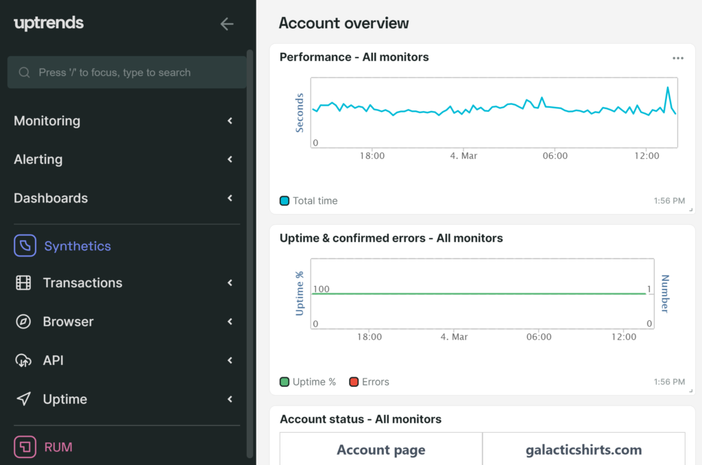
One interface to rule them all
The new user interface houses all of our three core products (Synthetics, RUM and Infra) in one central place, making it easy to toggle between products, combine data from each of your used products, and have a clear and complete overview of all your data.
Overhauled menu for easier navigation
As we kept adding more monitoring options, we started to reach the limit of what we could add to the previous horizontal navigation menu. Based on the feedback we received from users and our plans for the future, we decided it was time for a change.
Some of the main highlights of the new menu include:
- It’s easier to find settings, dashboards and other functions.
- You’ll have access to related functions directly from the menu.
- Large accounts can navigate through data more easily.
- You can collapse and expand the menu, giving more (or less) space to dashboards. Optionally, you can pin the menu.
- The side menu has more space to show relevant menu entries (commands or links to information).
Quickly find your settings, dashboards and other functions
One of the main goals of the new side menu is to make it easier to find dashboards and functions. We’ve added a search function built into the menu itself.
For any search phrase, we’ll search the menu itself, and:
- we’ll look through your monitors (based on monitor name and monitor type);
- we’ll look through your operators.
In future updates, we expect to expand the search function even more.
PS: the menu is also fully usable via keyboard.
Learn about topics with sidebars
The sidebar lists the most important settings involved with a certain topic, and has links to several KB and Academy articles for learning more about the different concepts related to a topic you see on screen.
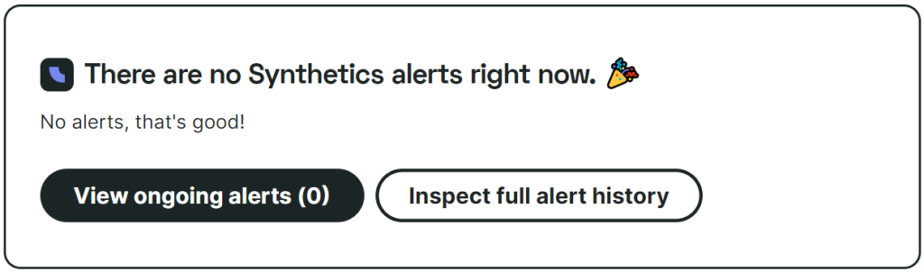
Error badges per product
When one of your monitors errors, we’ll show a yellow or red error badge next to the product that’s producing the error. That gives you a quick indication of whether it’s your synthetic, real user, or infrastructure monitor that’s giving problems.
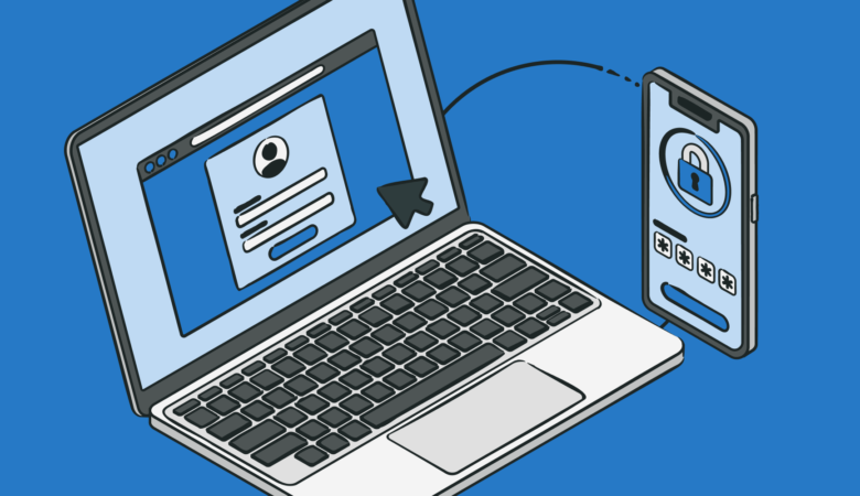
Better visualize and access your data
Your dashboards and tiles have been refreshed as well. They feel lighter, less dense and more unified.
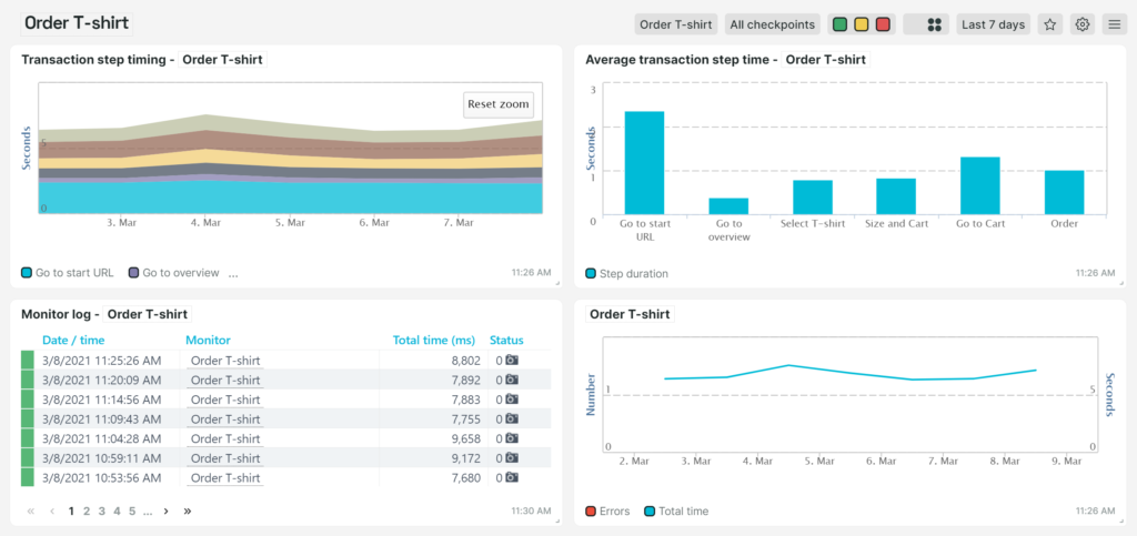
This slightly more subdued look is meant to be less distracting by putting focus on the on-screen data. There is now more space available to make existing options and filters more readily visible.
Existing setting screens, popups, dialogs, buttons and other visual elements will be changed along the way.
Favorite your most important dashboards
Each dashboard can now be marked as favorite. Just click the button at the top right of the dashboard while the dashboard is visible. The favorite dashboards show up as quick links in your menu.

Select which dashboard you want to see when you log in
You can specify an account-wide setting that sets the dashboard you see when you log in, by picking a dashboard in the account settings (go to Account settings, and then Account setup). It’s possible to specify one of your custom created dashboards, provided that the custom dashboard is actually shared with all users.
Each user can optionally pick their own default dashboard by choosing the appropriate option in their user settings.
This option is very useful for individual users, and should also make it easier to create auto-login setups for running a dashboard in kiosk mode.
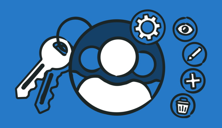
Better assistance with your monitoring setup
Hubs highlight related functions for a given topic, and act as a central starting point for key areas required for a good monitoring setup, like alerting for example. They explain important concepts that help you understand a certain topic faster and can show metrics that express how healthy your current setup is.
Duplicate tiles on a dashboard
Sometimes it’s easier to quickly create different variations of a tile on the same dashboard, without having to check each and every setting for that tile. That’s why you can now easily duplicate any tile in your dashboards. To duplicate a tile, open up the tile settings and click the Duplicate tile button. The new tile will appear at the bottom of the dashboard.
Marking the next Uptrends era with a new identity
Together with the update to our user interface, we’ve been working on a refresh of our brand, resulting in a new logo, marketing website and illustrations. We wanted to make things look more cohesive across the board, so we’re excited to welcome a new and modernized brand system that looks more balanced and straightforward, and allows us to communicate with you in a more transparent and clear way.
![]()
Our new logo
When we started Uptrends in 2007, we only offered uptime monitoring, that’s why the original symbol in our logo represented a traffic light. It’s 2021 now and we’ve come a long way.
Today, our horizon reaches way beyond uptime monitoring, and we’re much more than just an uptime status provider. Our unified family of products helps you monitor, analyze, and improve your entire range of online assets, from websites to servers, and from APIs to disk space.
Other than recognizability, the traffic light symbol didn’t really add anything conceptually anymore, so we’ve built a new logo that’s more in line with the company we are today.
![]()
The subtle touch to the u-character adds a little emphasis to our company name, and symbolizes upward trends. By replacing the traffic light and uptime metaphor we can see “upward trends” in a broader perspective.
What else is on the menu (no pun intended)
You’ll see more and more things adapting to the new concepts in the coming period. For existing customers: If you haven’t tried out the new menu yet, you can give it a try by using the button that says “Try the new menu” in the top right corner of your dashboards. If you’re currently trying out Uptrends, you’ll have the new menu automatically.
Any feedback is greatly appreciated. We want to know what you like about your new navigation options, and how we can improve even more. Just use the Give feedback button under Support, located in the new side menu.
We’re also steadily updating our Support documentation to reflect the changes, but there might be a period where some guides contain outdated UI concepts, so if you get stuck somewhere, please feel free to reach out to our Support team or your account manager.
We hope you like the new Uptrends. Stay tuned for further updates!