
Running a website today isn’t the same as it was 10 years ago. Now you need to make sure your site runs perfectly across multiple web browsers, devices, and screen sizes. Up until now it could be difficult to predict exactly how your website would perform under different conditions, but Uptrends has an easy solution with our two newest features!
What is Mobile Website Monitoring?
The majority of internet browsing is now done from a smart phone or a tablet. To ensure your website performs well and displays properly across a plethora of devices, you can use Mobile Website Monitoring. Now you can rest easy knowing your website performs just as well on a Samsung Galaxy as it does on an iPhone or iPad.
How does it work?
Don’t worry, you don’t need to perform any complex downloads or even own any of the devices you want to test. We use a simulated browser experience in Chrome to emulate the screen size, resolution, and user agent. A wide variety of device models is available – test your site on iPhone, iPad, Google Nexus, Samsung Galaxy, Kindle Fire and more! For an even more authentic monitoring experience take advantage of our bandwidth throttling to simulate different connection speeds, giving you a very realistic performance simulation for your mobile users.
To set up just follow these simple steps:
- When setting up a new monitor, select either “Real Browser Check” or “Full Page Check” for monitor type.
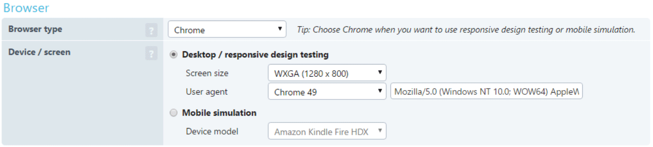
- Under the “Advanced” options tab you can change the browser type. Set it to Chrome.
- New options appear, allowing you to change the screen size for responsive design testing, or select a mobile device for mobile monitoring.
- Click on the save button, and that’s it!
Once you’ve saved the monitor you’ll immediately start receiving data regarding the performance of your mobile website. Everything from your transactions to the responsive design of the site can be monitored to ensure that your users are always getting the best online experience.
What is Multi Browser Monitoring?
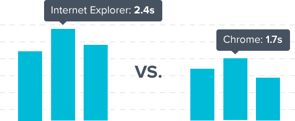
Just like how your website can perform differently across multiple devices, your website can perform differently just across different web browsers. With Multi Browser Monitoring you can select from three different browsers for monitoring – Google Chrome, Internet Explorer, and Phantom JS. Everything is spun from an authentic browser, so the results are 100% real – No simulations!
How does it work?
Multi Browser monitoring shows you exactly how your website performs in different browsers. Set up is very similar to the set up process for Mobile Website Monitoring. To set up a Multi Browser monitor, simply:
- Select either “Real Browser Check” or “Full Page Check” for monitor type.
- Under the “Advanced” options tab you can change the browser type. There are currently three availabile – Google Chrome, Internet Explorer, and Phantom JS.
- Select which browser you want to monitor from and that’s it! Save the monitor and you’ll start receiving data right away.
Want to see how your website compares across all three browsers? Simply create a monitor for each one. If you load them into a single dashboard you can keep track of your metrics across all of the browsers on one screen! The Uptrends Academy explains how you can work with custom dashboards.
Anything else?
That’s it! These new features are live now and are ready for you to try them out. If you have any questions our staff is standing by and happy to help!


Leave a Reply