
As a website or web service provider, you live and die based on your KPIs (Key Performance Indicators). In this article, we define those KPIs and help you decide which tools you need to monitor and track the KPIs you care about.
The KPIs you care about are often associated with the department in which you work. DevOps cares about performance and uptime KPIs, marketing pay’s closer attention to the acquisition, bounce rates, and conversion rates, and the User Experience (UX) team cares more about functionality and ease of use. Although all of the various metrics are important, all teams should concern themselves with performance and availability KPIs first and foremost because they affect every aspect of a website or service.
Why do performance and uptime KPIs matter?
Poor performance or frequent or lengthy outages erode user perception and trust. Studies have shown that a half-second delay can significantly degrade the user’s opinion of the website and even influence their feelings about page aesthetics.
Site issues such as slow loading pages, malfunctioning web applications, and downtime have issues beyond the immediate problem. Sites with issues also experience lower search engine rankings, increased bounce rates, higher cart abandonment rates, reduced user engagement/retention, and decreased customer satisfaction. So, if you’re a SaaS provider, e-commerce site, or a content marketing website, you need to track and know your KPIs.
Uptime/availability KPIs
The first KPIs you should consider are those that relate directly to availability. Whether you provide a web service, SaaS product, content marketing, or run an e-commerce site, if your users can’t get to your site or use your service, you’re sunk.
Uptime percentage and high availability
Your uptime is a simple ratio of your actual available time divided by the total period minus any planned maintenance. Common SLAs (Service Level Agreement) promise 98% uptime (7.31 days of downtime per year) up to 99.99% (52.60 minutes of downtime a year). Typically, the closer an SLA gets to 100% (high availability), the higher the cost of the service to the customer.
Monitoring and documenting SLA compliance
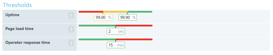
With Uptrends SLA Monitoring, you can check SLA compliance at a glance. First, you set up your SLA definitions to capture three important KPIs.
- Uptime: Set your required uptime percentage and your danger threshold percentage.
- Page load time: The performance standard agreed on.
- Operator response time: This is how long an error can go unintended. An Operator logs into Uptrends and confirms that they are aware and working on the problem.
You can use and apply multiple SLA definitions and view them in your SLA dashboard. When a monitor is out of compliance with an SLA, it appears red on the report. Uptrends calculates and saves the data independently of your monitor detail records, and you can create an SLA document to represent any period and any monitors you would like.

Performance KPIs
We touched briefly on the page load time KPI in the discussion about SLAs. The SLA tracking does capture page load time, but it doesn’t include the details and other KPIs you probably care about such as time to first byte or connection time.
Below we have KPIs on an element-by-element basis and at page level context. Although many of the listed KPIs look the same, it is really what they represent that needs considering. For example, DNS resolve time is for a single element where DNS duration is about the amount of time spent resolving addresses for the entire page.
Webpage Performance KPIs one request at a time.
Each page element has its own cost in performance, and the combined costs for each element’s KPIs add up to contribute to overall page KPIs. Looking at individual elements allows you to identify problem URLs and page elements like images and script files.
You can get these KPIs from Uptrends’ Web Performance Monitors. The Full Page Check (FPC) monitor spins up a real browser (take your pick of Chrome, Internet Explorer, Firefox, and Phantom JS). Next, the FPC initiates the first request, and the monitor tracks the performance KPIs for each page request after that.
You can view the KPIs on a per-check basis in your check detail reports, or you can use your Performance Dashboards to see how your KPIs perform on average over time. First, we’ll take a look at the meaning of these KPIs, how they look in a waterfall report, and how they do on average over time in line charts.
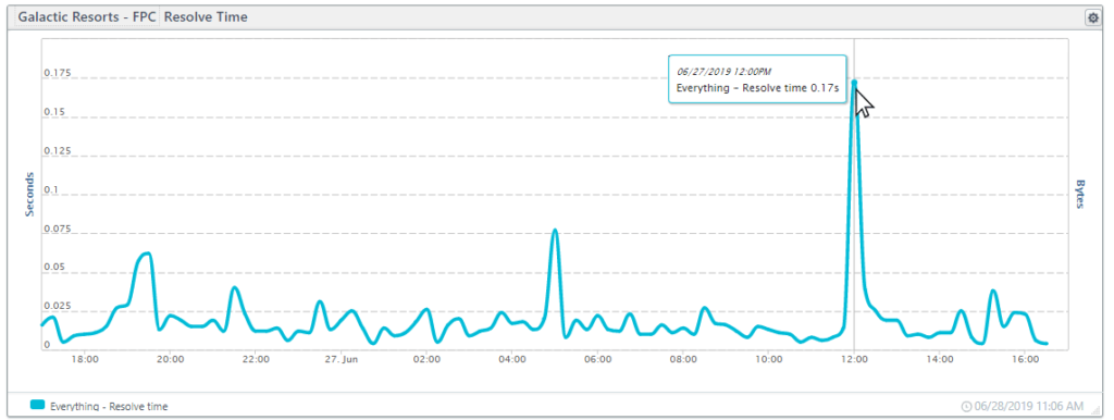
Resolve time
Resolving a domain name to an IP address is the first step in forming a TCP/IP connection. A slow resolve time could be an indication that:
- The URL is redirected requiring additional DNS lookups,
- The primary DNS is overwhelmed, or
- The TTL (time to live) for the address is set too short, causing the browser to do additional lookups.
Using the Full Page Check dashboard, we can see the fluctuation of the address resolve speed over 24-hours. The large spike in the chart below occurred when resolve times suddenly jumped up for 15 minutes with the longest resolve time at 2.6 seconds.
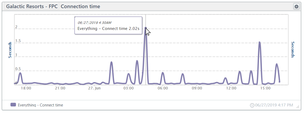
TCP connect
The TCP connection time includes the time it takes to form the initial IP connection to a server and includes the TCP connect and HTTPS handshake. Optimizing performance for the TCP connect is complex. If you would like to learn more, O’Reilly offers a good TCP performance optimization overview.
Below we have a line chart showing 24-hours of connection times. The center spike is due to a time-out error in the connection.
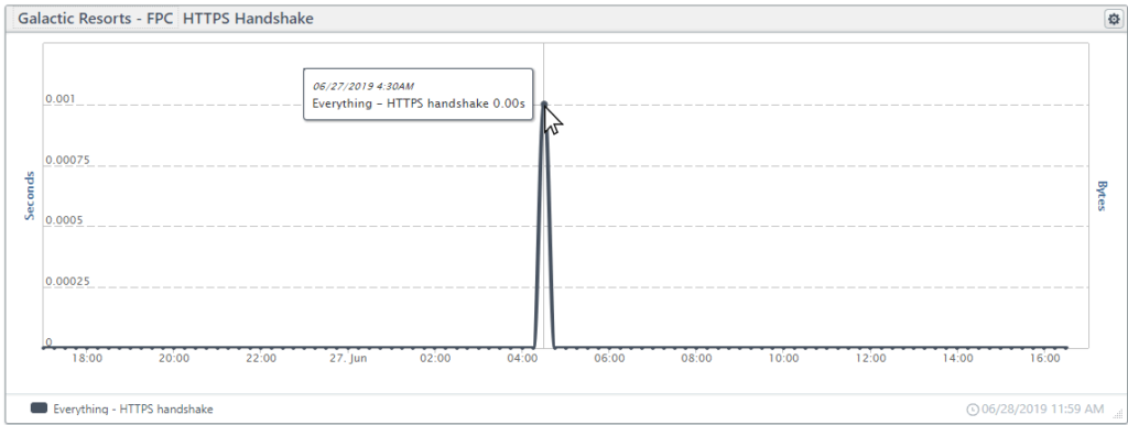
HTTPS handshake
Part of the TCP connection, the HTTPS handshake is the time it takes to establish an encrypted connection using SSL/TLS. To create a secure connection, first, the server presents a certificate that the client accepts, next, the server and the client exchange encryption keys to form secure communications. Once the HTTPS Handshake completes, the client can request the content.
In the tile below, you can see that the handshake is a small part of the connection that typically takes less than a micro-second. The spike is due to the same time out on the connection chart shown above.
Send time
Once the client and server form a connection, the client (the browser) can request (GET) the content. The “send time” is the time it takes for the client to package and input the request to the server. The send time is typically less than a microsecond. We would include a graphic, but it is merely a flat line at zero seconds, so there isn’t much fun in showing that.
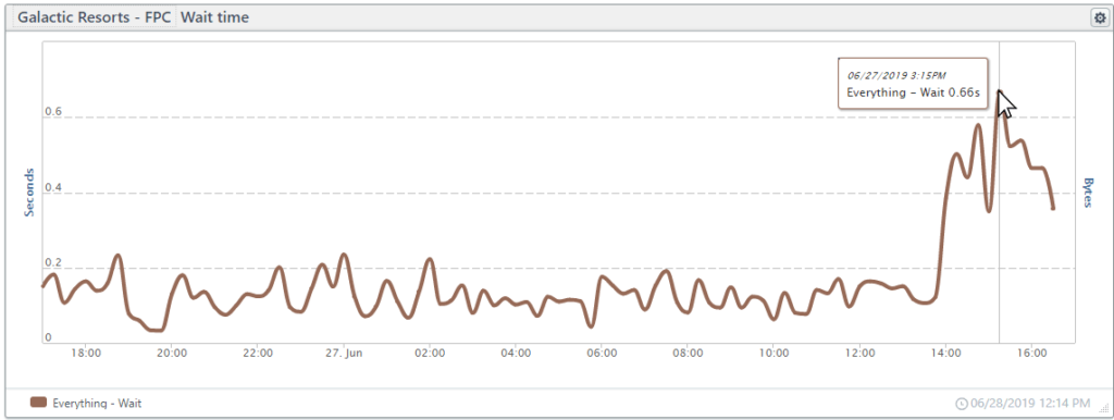
Wait time
Once the browser sends a request, the browser waits for a response. The wait time is the time from the send untill the response. Network latency and server processing/response times affect the wait time.
In the chart below, wait times were as expected, but wait times skyrocketed starting around 2 pm with some wait times as high as 7 seconds.
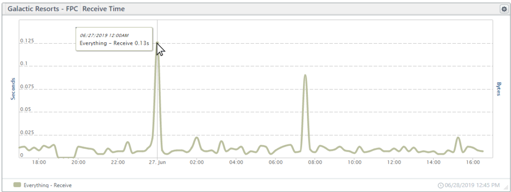
Receive time
The time from the first byte of data until the last byte of data reaches the browser is the receive time. The receive time is frequently under a single microsecond, but for larger files such as images, the receive time may become significant.
In the chart below, the spikes in receive times are due to third-party elements (images and style sheets).
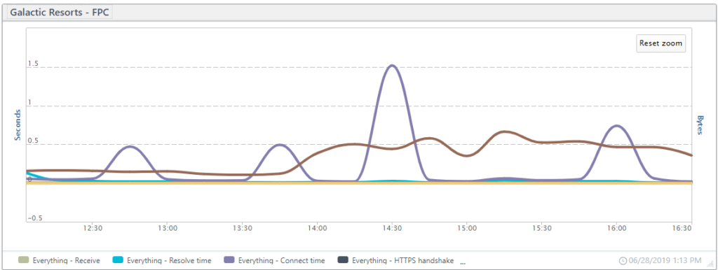
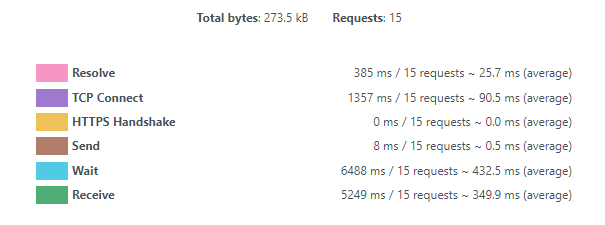
Putting it all together
Combining all of the KPIs in a single line chart, you can see how the different spikes may influence each other. In the chart below, spikes in connection time coincide with longer wait times.
A deeper look into the FPC waterfalls
With each Full Page Check, you get a waterfall report where you can see which elements have a problem, and you can find exactly which part of the communication has the problem. The waterfall below captures some of the long receive times (green bars) contributing to the spikes in the receive time chart above. The wait times are a bit long as well (blue bars).
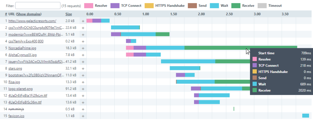
At the bottom of each waterfall, you get the total time and the average timing for each metric combined for the page.
All of the element-level KPIs add up and form our page-level KPIs. You can use our performance dashboards to get page-level KPIs based on averages from each monitor. Also, you can combine the data for multiple FPC monitors to get performance data on a site level using the performance dashboards.
Using Real User Monitoring, you can also get detailed site-level KPIs based on different user environments.
Site-level (and page) KPIs from Real User Monitoring data
Above we looked at the KPIs on an element-by-element basis for a single page. Real User Monitoring (RUM) allows you to view these KPIs in different interesting ways that can lead to some very user-specific optimizations.
With RUM, you can get experience data directly from your users as they navigate your site. You’ll get data that you can sort based on the various environment variables that make each user’s experience unique. You can sort and get site or page level KPIs based on:
- Device type
- Operating system (and version)
- Browser type (and version)
- location (country and in some cases state or province)
How does RUM work?
It’s pretty simple. First, you add a new RUM site. Second, you take the tiny script generated and add it between the HEAD tags on the site and relaunch the site. Third, take in all that rich user experience data.
Uptrends gathers and aggregates the user data and makes it available to you in near real-time. Arrange your data as you like in your RUM dashboards.
Load time KPIs
Your load time KPIs tell you how fast your server responds to a request, and how long it takes to download and render the page. These KPIs tell you how your user experienced the page with respect to page load.
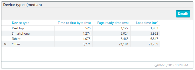
In the table below, we take a look at the load-time KPIs based on the device types used. The “Other” category includes less commonly used devices. By clicking, you can drill down and see what devices “other” represents. In this case, the “other” category consists of TVs (TVs don’t seem to do too well with this site).
You can see that the site does well for desktop users, but other devices have much longer wait times for their content.
You’ll notice that the times reported as load time are not the sum of time to first byte and page ready time. Uptrends calculates these values independently of each other based on median values, and the time to first byte is actually a portion of the time shown for page ready time.
Time to first byte (TTFB)
When a user requests a resource, the time from their request until the browser receives the first byte of data is the time to first byte. A long time to first byte is a signal that either the server’s response is slow or network latency is a problem for the user’s location and connection type.
Page Ready time
The page ready time is the total time it takes to render the page completely with all elements interactive.
Network performance KPIs
Your network duration is the combination of the redirect, DNS, and connection times.
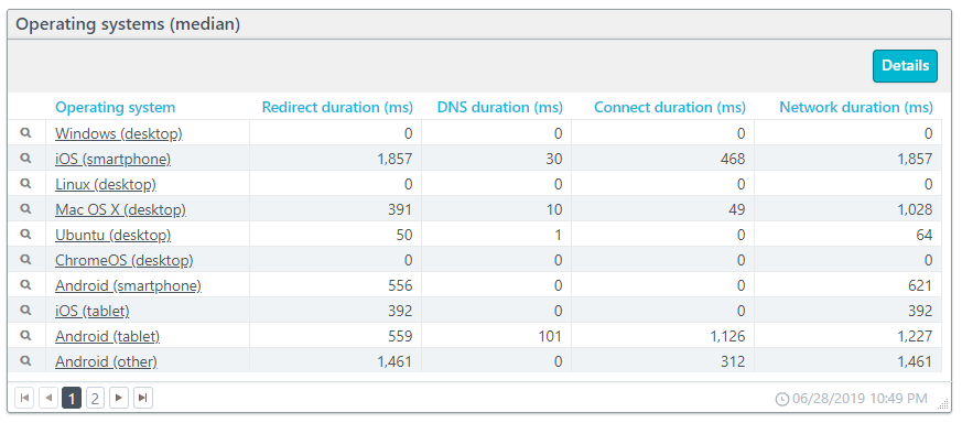
For this example, we will look at operating systems (see below). You will notice the magnifying glass icon next to each entry. By clicking the icon, you can drill down to see the data broken down based on the operating system version.
Redirect performance
If your site redirects user requests from one URL to another, you add time to the connection. Redirects may not have a substantial hit to your page performance, but when redirects become chained (a redirect to a page that also has a redirect), you can add serious delays. Watching the redirect duration can keep you informed when/if redirects become a problem.
In the example data above, you can see that redirects contribute to a lot of additional connection time due to the time spent on redirects. The desktop versions of the operating systems don’t have any time at all spent on redirects, but redirects cost considerable time for some mobile operating systems.
DNS performance
As discussed before, the DNS resolve is the time it takes to get the IP address based on a domain name. Most pages have content coming from multiple unique URLs, and each unique URL requires its own resolve. The DNS duration is the combined time it takes to resolve the pages URLs.
In the example above, due to the redirects for mobile users, mobile users have longer resolve times.
Connect performance
Connect duration is the time it takes to complete a connection between the client and the server. The connect duration includes the HTTPS handshake and the TCP connect.
In our example above, connection times with exceptions for Android and iOS remain short at less than a microsecond.
Backend performance
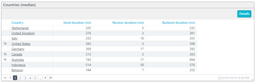
The backend duration includes the times for sending and receiving information, but not the time to process and load the contents. In the example below, we have the backend durations based on the users’ locations. The country entries below with a magnifying glass drill down to state/province level data.
Send performance
The send duration is the time that it takes to package and send data from the client to the server. Of course, the more data that needs sending by the client means a longer send duration. The slowest connection between the client and a server determines the total time to send the data.
Receive performance
The receive duration is the time needed to send data from the server to the client. The receive time is directly proportional to the amount of data sent and the connection speed. The slowest connection results in the total time for the receive duration.
Frontend performance
The frontend duration is the combined time for parsing and loading the DOM (Document Object Model) with the time to render the content for the page.
In the example below, we have the frontend duration as experienced on different browsers. Drilling down, you can get the frontend durations based on the browser version used.
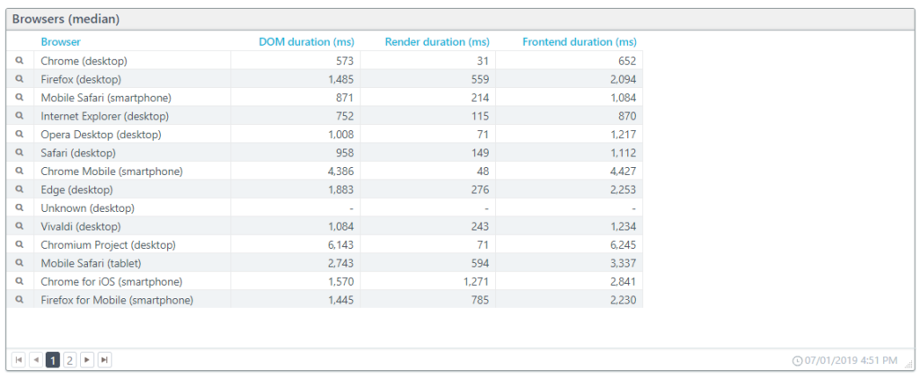
DOM performance
Each request results in added content, and the browser upon receipt processes that content. The browser uses the combined responses to construct the DOM (Document Object Model). Once the browser constructs the DOM, rendering can begin. The DOM duration is the amount of time it takes the browser to process the HTML (including scripts and CSS files) into a DOM.
Render performance
The render duration is the time it takes the browser to take the DOM content and display it on the screen. The render duration is a direct measurement of the browsers processing speed.
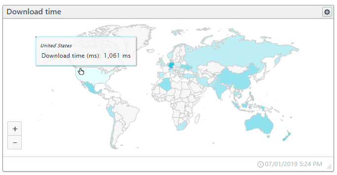
Download performance
The total time it takes to request, receive, process, and render the content. The download time ends when the browser indicates that the DOM has fully loaded for the page.
The interactive map below shows the download time per country. Clicking the country takes you to a new dashboard specific to the country.
Takeaways
- Website and web service performance and uptime KPIs are essential across the board for all departments: development, system operations, marketing, and sales.
- Frequent or lengthy outages destroy user confidence in the brand.
- If you have an SLA with a provider or offer one to your customers, you need SLA monitoring to prove compliance or noncompliance.
- Synthetic and Real User Monitoring is essential for tracking performance and uptime KPIs.


Leave a Reply